Estimated reading time: 4 minutes
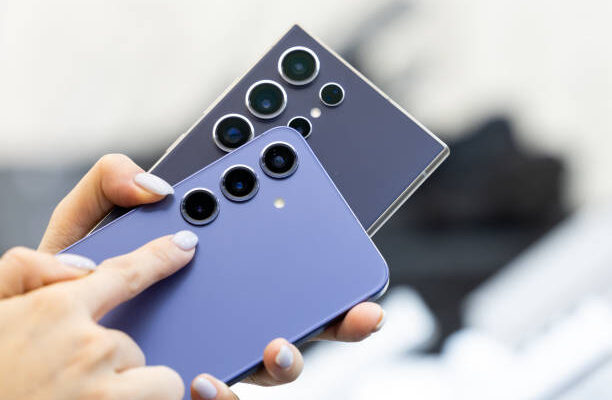
I have been using Android phones for more than ten years now, and when you get a new phone, you take a huge step forward. Though I have worked for HTC, in recent years, I have become a Samsung phone lover, and Samsung’s One UI is the perfect Android interface I have always wanted to see.
Yes, I know, hence this will provoke a backlash, a backlash that I gladly accept, so here is why I stand on this position.
One UI Offers More Customization
From my experience, it’s taken Samsung years of development to turn the One UI interface into something usable. After all, One UI hasn’t just appeared overnight. It’s been a process, developing over the last few years into something that users like me would want to use.
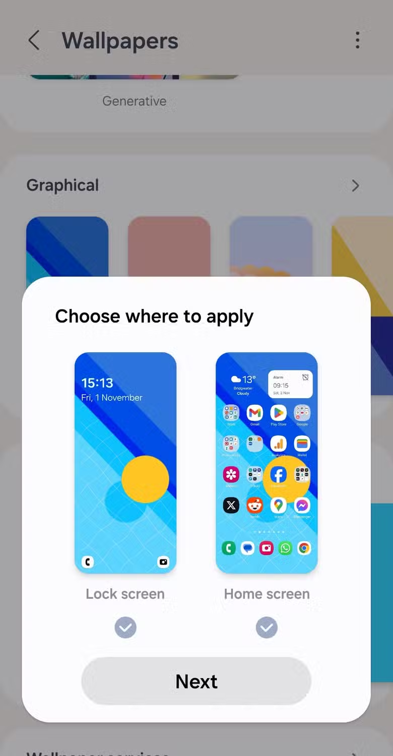
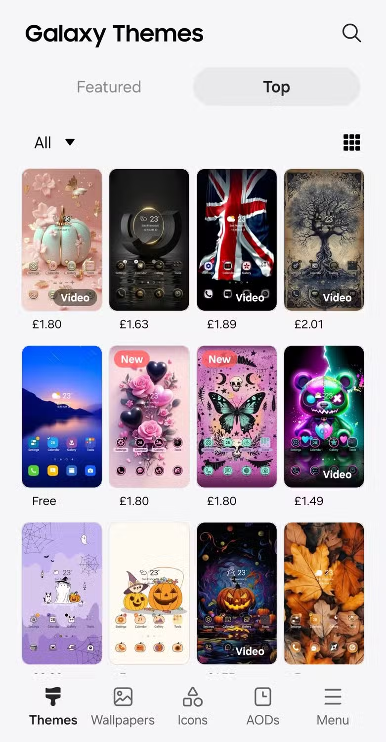
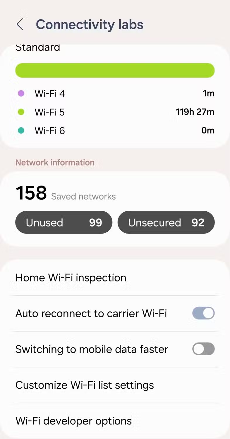
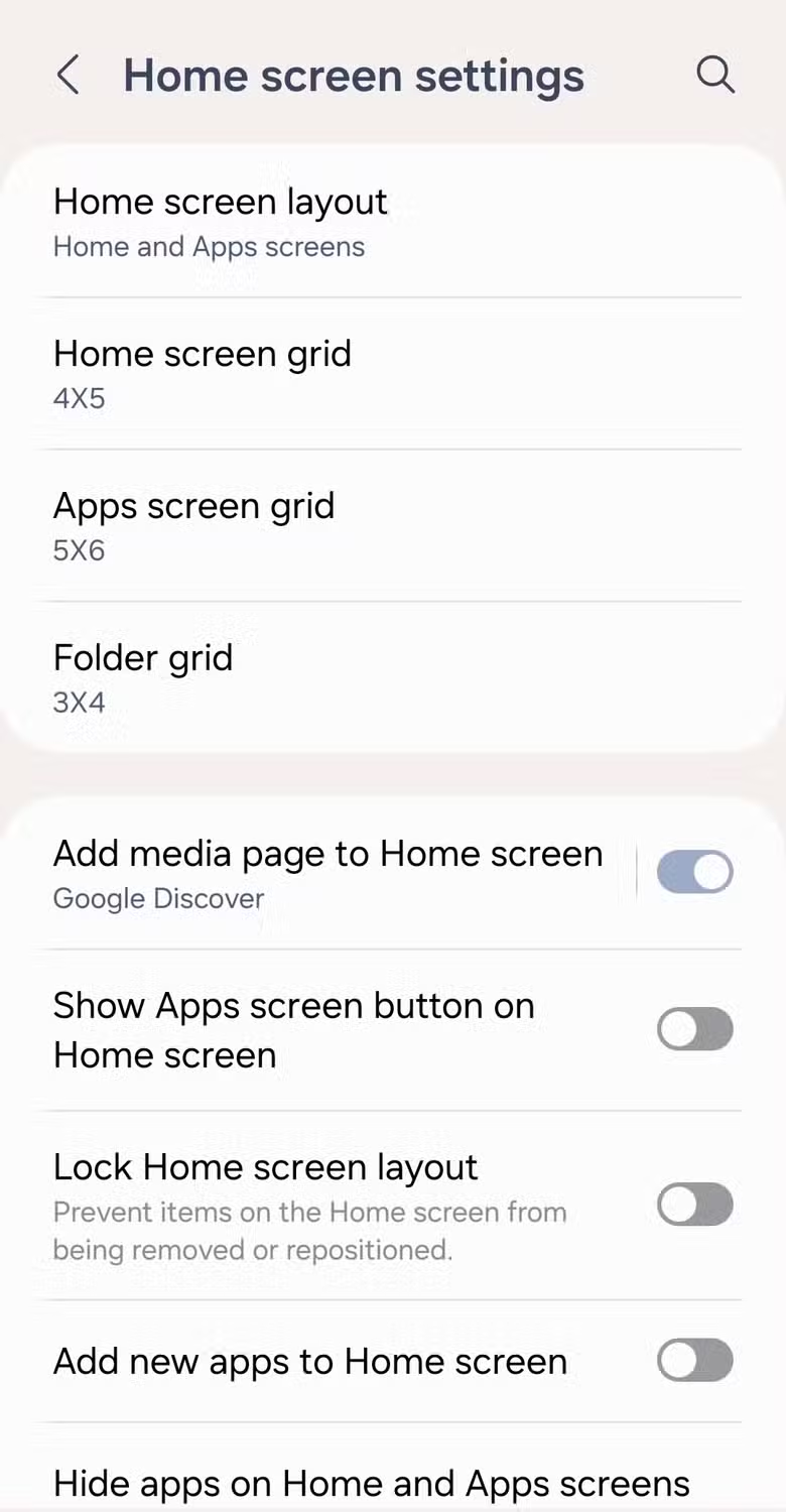
For me, one of the biggest wins for One UI over the experience you’d see on a device like the Pixel is the customization. It’s hugely configurable, whether it’s basic settings like changing your wallpaper or your lock screen or more hardcore power settings like configuring the order of your scanned Wi-Fi networks.
The result is that while One UI looks good by default, you can make it your own. Most of these settings are built into One UI, but an app called Samsung Good Lock lets you take the customization further.
If You Want Good Photos, One UI is Best
I’m not a great photographer—just ask my girlfriend. She likes to pretend that the camera quality on my Samsung Galaxy S23 isn’t as good as her iPhone, but most of the time, it’s because I just need to tweak a setting or two.
Thankfully, Samsung’s camera app is great for this, offering a huge number of easily accessible features and settings, along with plenty of presets. I can quickly enable a timer, change picture or video quality, switch the flash on, add filters, use a burst mode—the list goes on.

That isn’t the same for everyone. When I played around with a Pixel 9, the camera app felt lacking compared to my S23. It looks similar and has some of the same features, and while it’s certainly an improvement over recent years, it doesn’t feel as snap-ready as my S23.
Coming from a Samsung, and as someone who isn’t a professional photographer, I think I’d be disappointed owning a Pixel for that very reason. Given that our Pixel 9 review specifically calls out how good the Pixel 9’s camera is, it’s a shame that, for me, at least, the camera app on the Pixel isn’t as good. It’s good to see plenty of presets and filters, but it just doesn’t feel as intuitive to use as Samsung’s own.
Discover more from News Round The Clock
Subscribe to get the latest posts sent to your email.


